Quickbase Customer Stories
Quickbase
Customer Stories
Quickbase Customer Stories
Quickbase Customer Stories
Making it easier for potential customers to browse
Quickbase's case studies.
SCOPE
UI/UX
ROLE
Brand Design Co-op at Quickbase
CHALLENGE
An outdated and confusing experience for finding customer success stories.
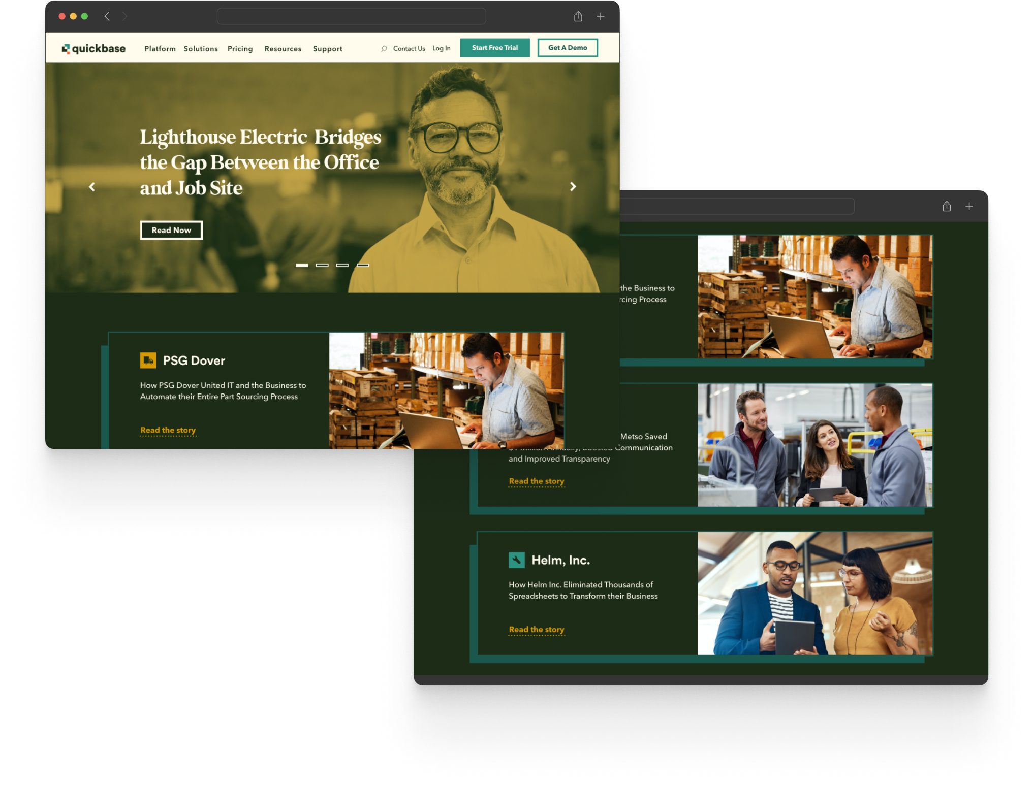
Quickbase enables its customers to solve problems by providing a platform where they can build apps without any code required. Browsing their customer stories is powerful and exciting, as you get to see the reach of the platform. It is an invaluable resource for prospective customers. Quickbase's customer stories page needed a redesign, a task that was handed to me as the company's Brand Design Co-op.
CHALLENGE
An outdated and confusing experience for finding customer success stories.
Quickbase enables its customers to solve problems by providing a platform where they can build apps without any code required. Browsing their customer stories is powerful and exciting, as you get to see the reach of the platform. It is an invaluable resource for prospective customers.
Quickbase's customer stories page needed a redesign, a task that was handed to me as the company's Brand Design Co-op.
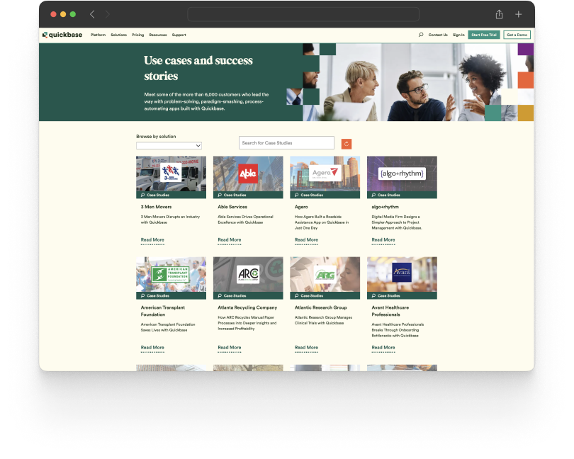
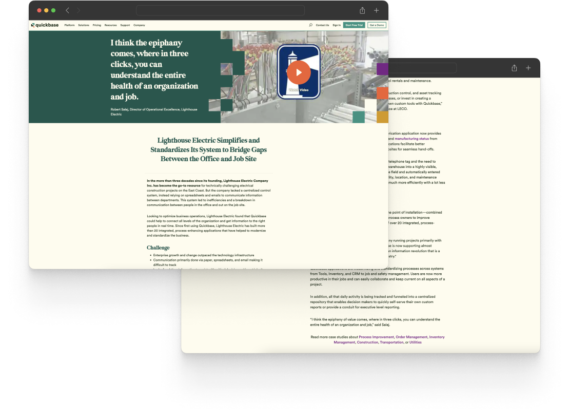
The landing page & individual case study pages needed to be restructured. The features and content would all stay the same, but I was tasked with rethinking the UI of the pages and reordering some blocks of content.
PROCESS
I first completed an audit of other low-code platforms' case study pages. Since we weren't looking to add any new features, I just focused on the structure and flow of the pages in my audit.
I presented my findings to a developer and designer on the web team and got their feedback.
PROCESS
I first completed an audit of other low-code platforms' case study pages. Since we weren't looking to add any new features, I just focused on the structure and flow of the pages in my audit.
I presented my findings to a developer and designer on the web team and got their feedback.
PROCESS
I first completed an audit of other low-code platforms' case study pages. Since we weren't looking to add any new features, I just focused on the structure and flow of the pages in my audit.
I presented my findings to a developer and designer on the web team and got their feedback.
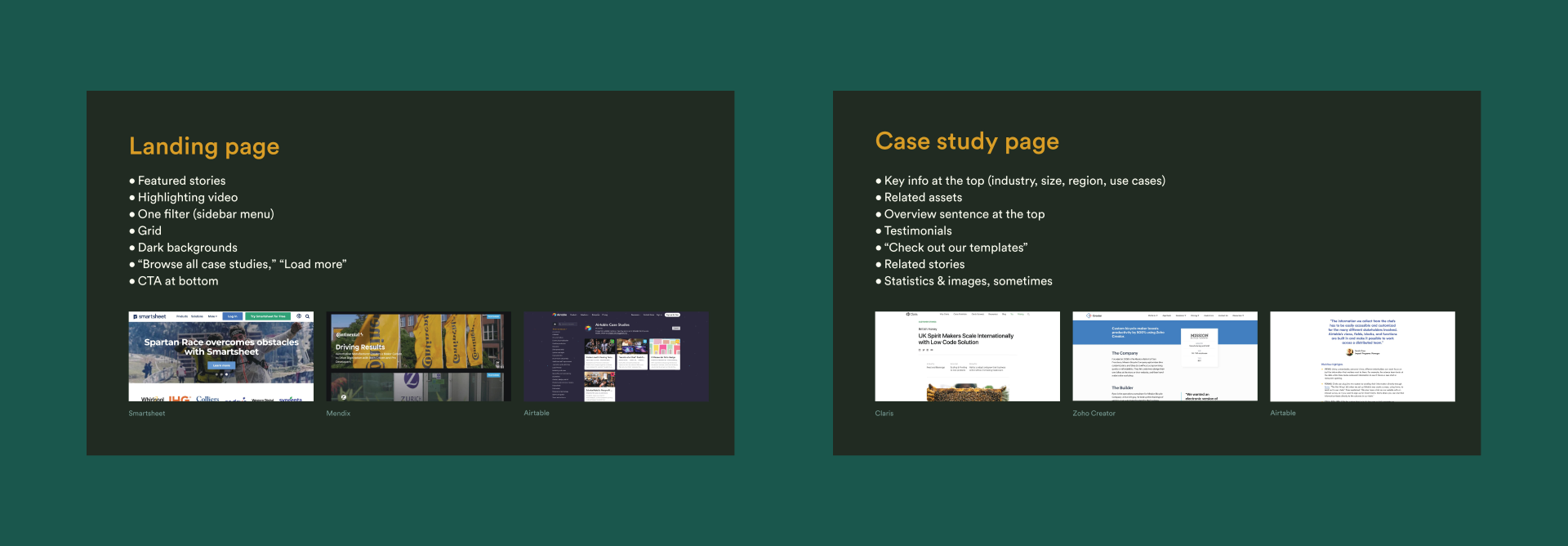
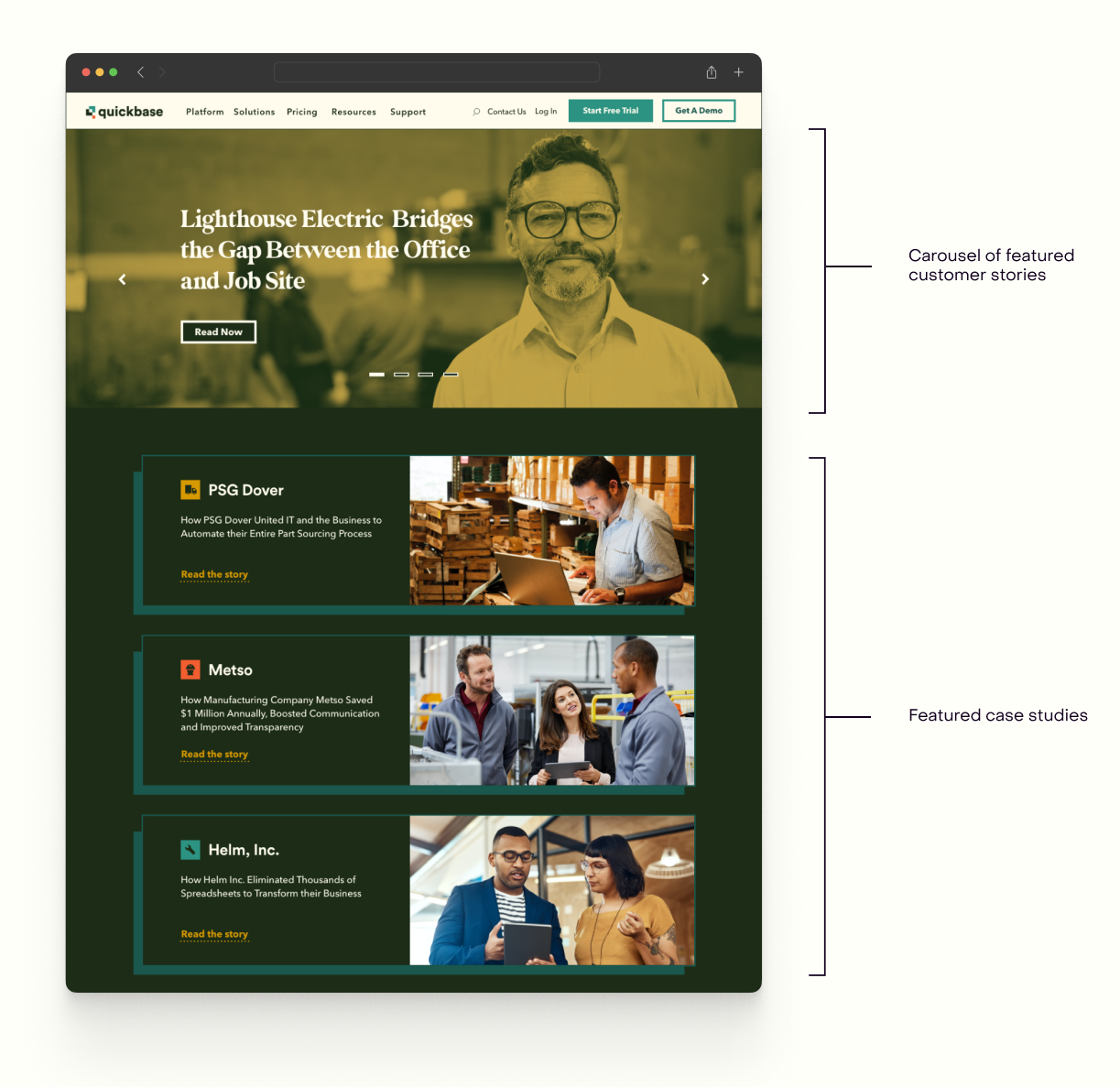
I then wireframed the landing and detail pages. I wanted to give more structure to the landing page, so I created sections for featured content by shifting the scale of certain images and introducing new card components.
Though not my intention, the UI and structure of the landing page ended up feeling similar to that of many dark-mode streaming platforms. I think because of this, the page has a fun approachability.
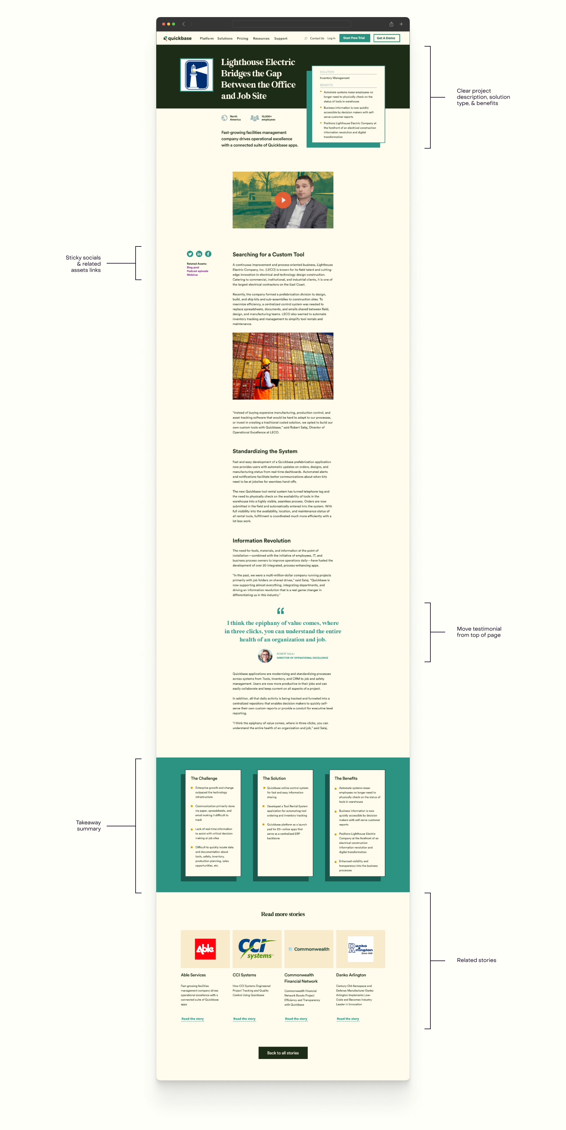
I wireframed the detail page next. I included the most important information, like the solution type and project benefits, at the top of the page; the old pages featured customer testimonials here, which was illogical to me. A summary of the challenges, solutions, and benefits is added at the end of the case study.
TAKEAWAYS
This was my first time working on a UI/UX project outside of a school environment. It was so exciting to talk with my coworkers about how we could reuse or adapt existing components in our design system. I find myself very interested in design systems now and excited to learn more.
TAKEAWAYS
This was my first time working on a UI/UX project outside of a school environment. It was so exciting to talk with my coworkers about how we could reuse or adapt existing components in our design system. I find myself very interested in design systems now and excited to learn more.
NEXT
_ _ _ _ _ _ _ _ _ _
SAM MARCHESI © 2022