Mendix Pioneers
Building a brand for a select group of top-tier customers.
Branding, Graphic Design
Overview
Celebrating Mendix's best advocates
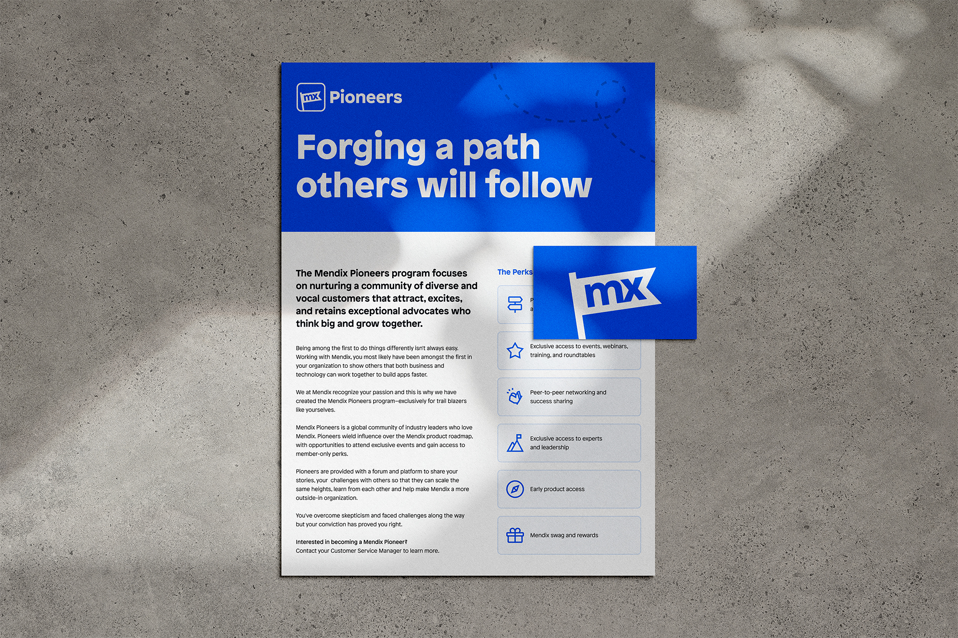
Mendix Pioneers is a community of enthusiastic Mendix customers who act as advocates of the platform. There are member-only perks like early product launches and exclusive access to events, trainings, and networking opportunities.
The existing Pioneers brand felt distant from the core Mendix brand. So, I was asked to lead a brand refresh, including a logo redesign and the creation of various print and digital assets.
Process
Blazing the trail
I began the project by reimagining the Pioneers logo. The previous brand identity centered around the theme of space exploration. In considering this themes of exploration, discovery, pioneering, and trail blazing, I landed on the image of a waving flag as the basis for the new logo.
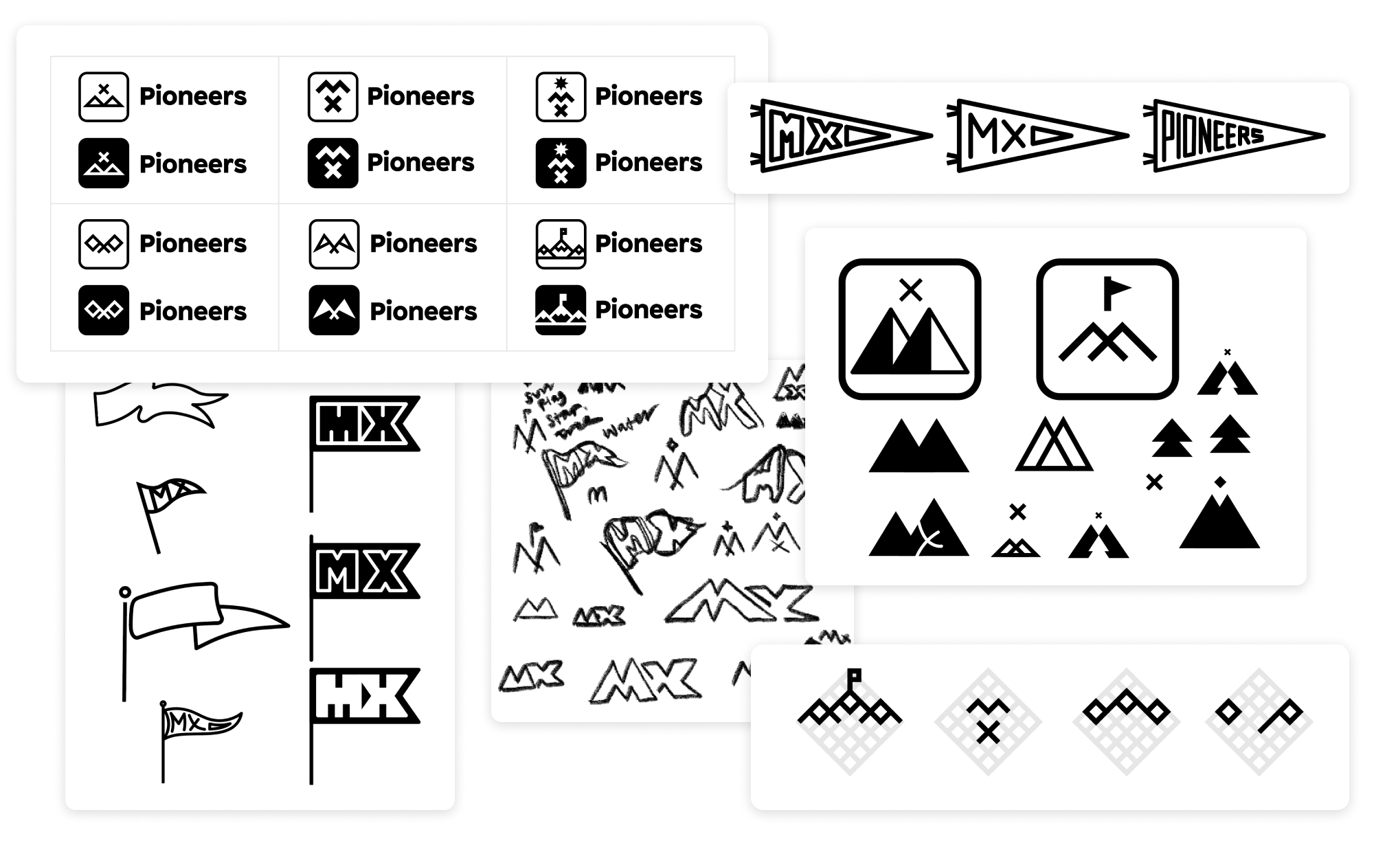
Many rounds of logo iteration
Mendix Pioneers is only one of many groups at Mendix that has its own sub-brand. We were at a crossroads for how this larger system of logos should work together. It was a fun challenge to figure out how this group would fit into a larger ecosystem of sub-brands. I landed on reusing the frame element from the primary Mendix logo in all sub-brand logos, and having a stylized version of "MX" that alludes to the group's focus area. This sets a standard for sub-brands going forward.
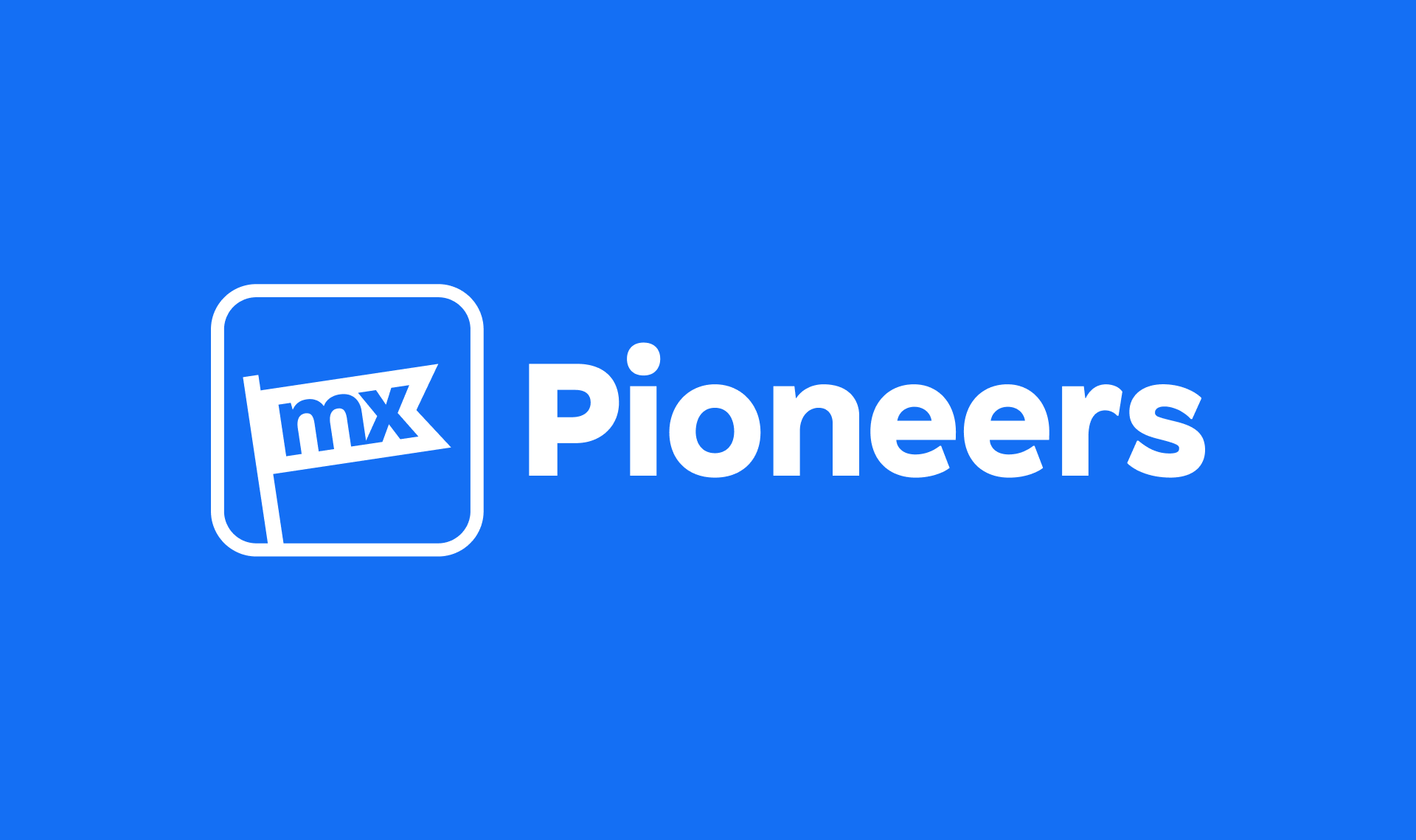
Internally at Mendix, saying someone is "BLUE" is celebrated, with each letter of the word standing for a different key trait (Brave, Limitless, Understanding, Exceptional). I centered Mendix Blue as the primary brand color for Pioneers since they are the Bluest of the Blue, driving home this group's connection to the wider Mendix brand.
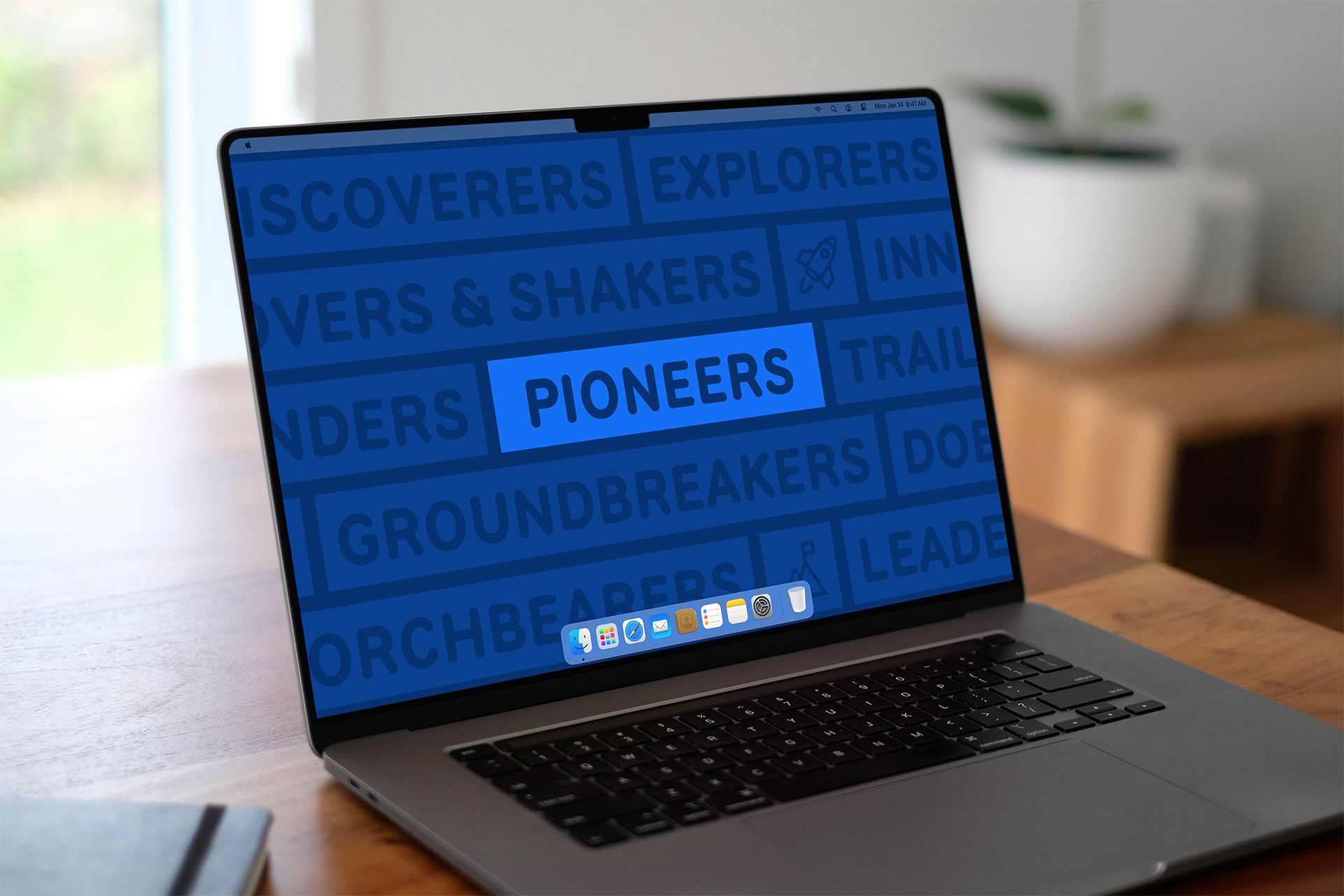
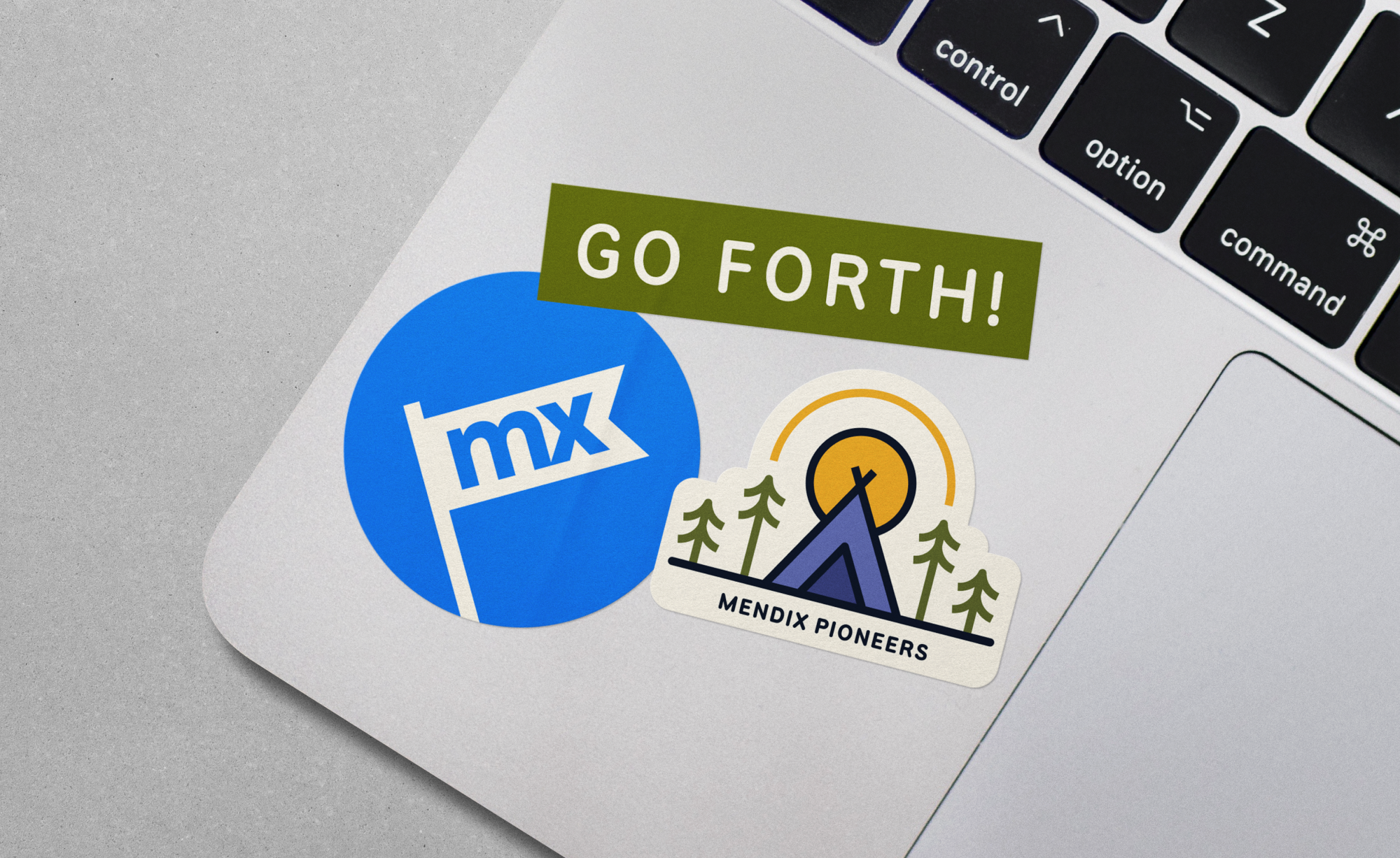
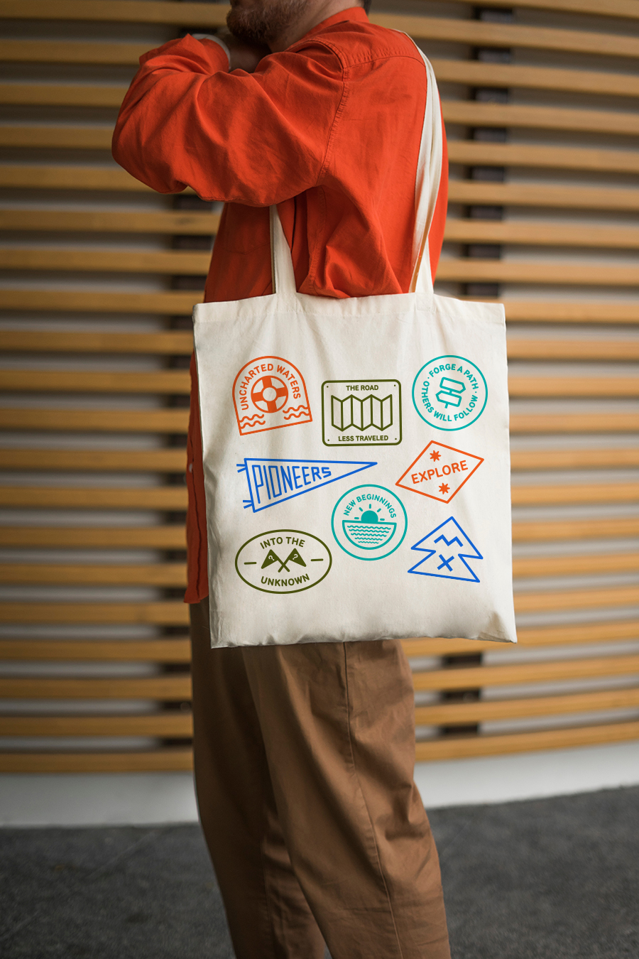
The brand features a set of illustrations that allude to camp signage and patches, meant to evoke the explorative and curious qualities of those spending time in nature. The typeface used, National Park, also is a nod to the wood signs with carved type one might see on a trail.
Takeaways
This was my first opportunity leading a sub-brand effort. It was an immensely fun challenge, and a great opportunity to design for Mendix's greatest advocates
Previous
hello@samanthamarchesi.com ◒ (c) 2025