Libby Redesign
Redesigning an app that allows users to access ebooks and audiobooks through their local libraries.
UI/UX
Overview
Reinventing a beloved digital library app
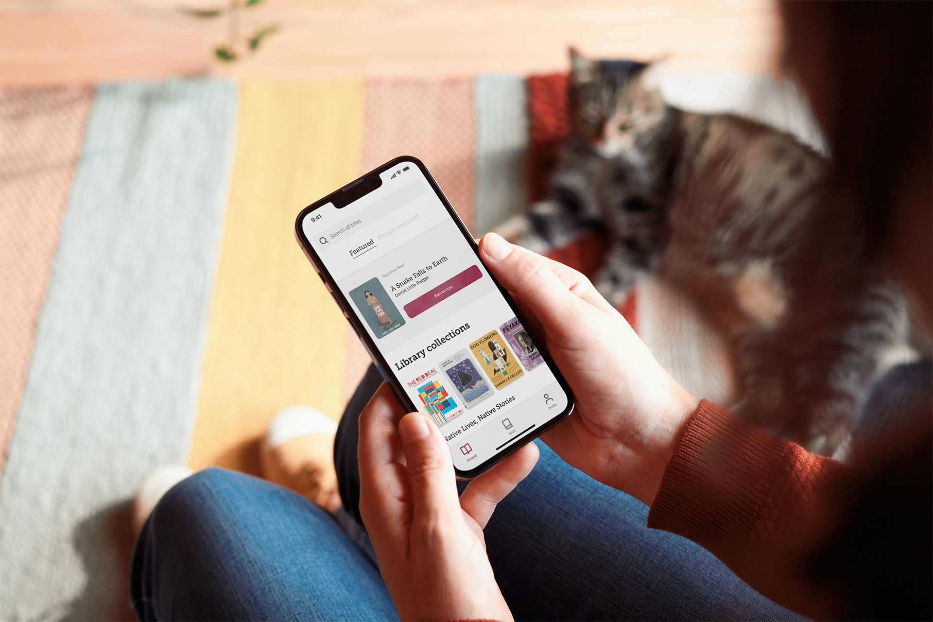
Libby is an app for borrowing digital titles from local libraries, making library materials accessible to those who might not otherwise have access. While I love its mission, the app is difficult to use. As the sole option for many library users, it should offer a better experience. To address this, I embarked on a personal project to reimagine the Libby app.
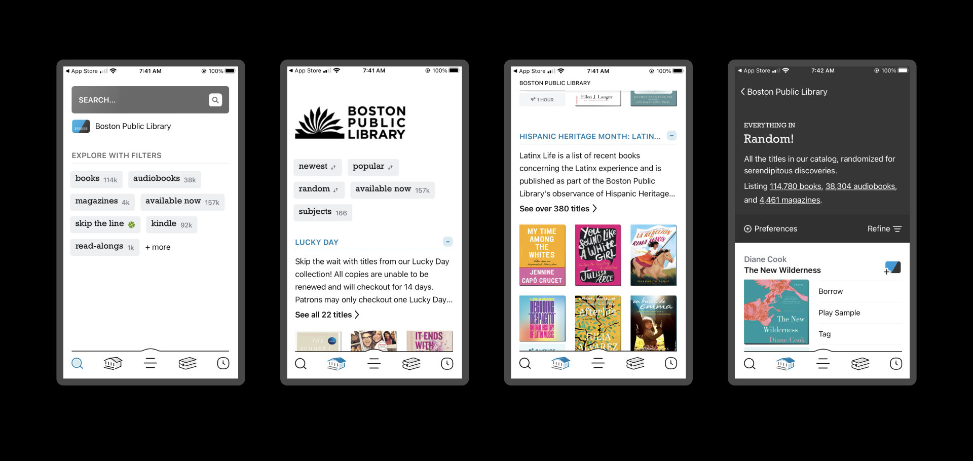
The current Libby app is not organized in an intuitive way
Process
Making it easy to navigate millions of ebooks, audiobooks, and magazines
I set out to make it easy and fun to browse Libby's expansive catalog. Users I spoke with and app reviews told me that navigating and filtering Libby's titles was a major pain point. Additionally, users wished the app was more tailored to their preferred genres. After this initial research, I mapped out a revised version of Libby.
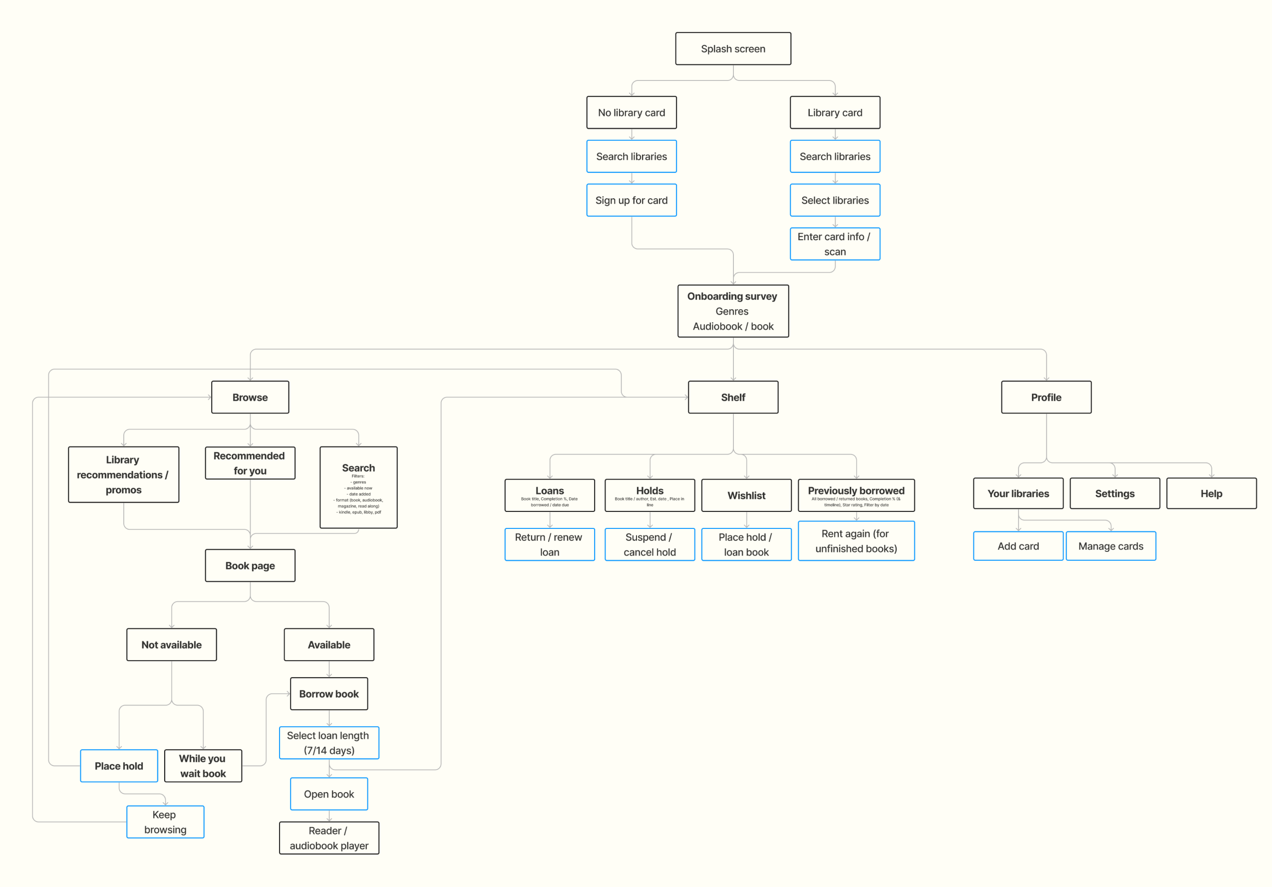
Lo-fi wireframes with Auto Layout applied helped me quickly iterate on my new browsing structure. I eventually landed on the idea of two main categories: "Library recommendations" and "Recommended for you". This was influenced by Spotify, whose homepage effectively displays media tailored to the user as well as featured media that is displayed to many/all users.
Simple lo-fi wireframes allowed me to ideate quickly
Solution
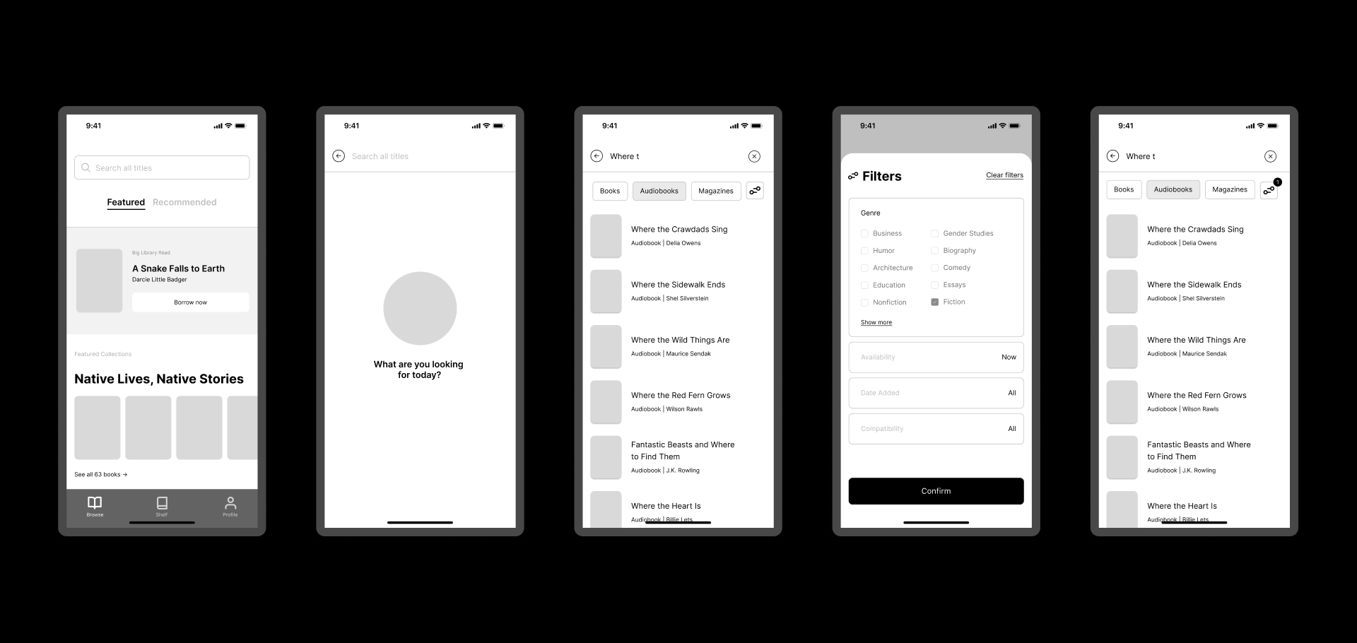
Intuitive categorization
My redesigned version would include in-app recommendations tailored towards one's literary tastes. An updated site map divided content into three distinct, intuitive categories (Browse, Shelf, and Profile). Users can find books one of three ways: browse library recommendations, browse recommendations tailored to their tastes, or search for a title.
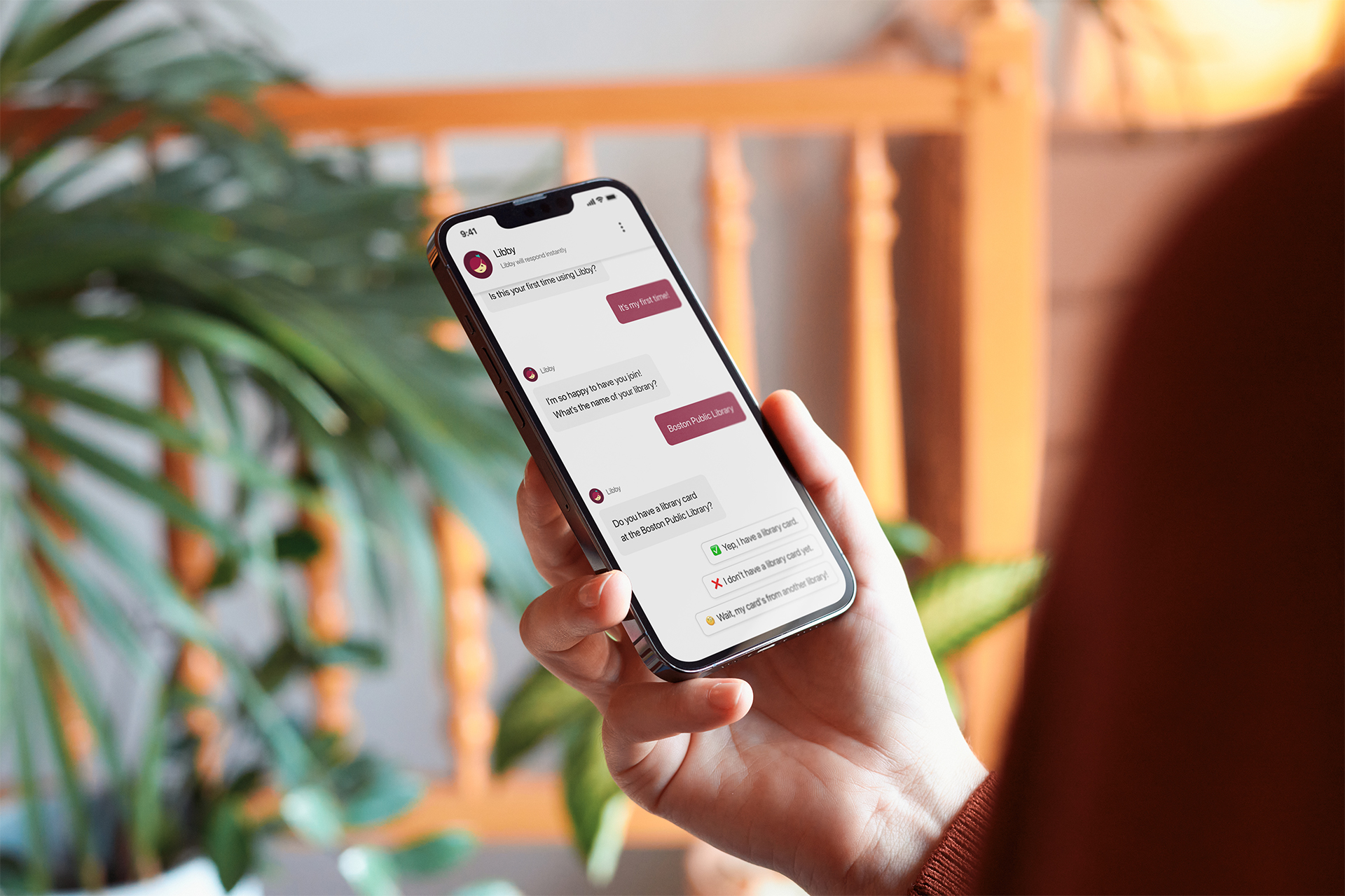
One larger UI update I made was surrounding the onboarding flow. Libby uses a chat-style UI in the onboarding flow, and I wanted to retain this decision, but the flow needed to feel more conversational. So, I edited the copy and reordered content to make it more natural.
Takeaways
After speaking with users, I knew my main goal in redesigning Libby had to be making this product more usable and simple. Focusing my energy on the app's functionality meant steering my focus away from other cool features I wanted to implement, but I knew usability was by far the most crucial improvement area. I'd like to test this new version of Libby with more users and incorporate their feedback to make it even more personalized.
TAKEAWAYS
As a designer, I sometimes feel like I'm creating things that push people further away from real life experiences. But with Make Space, I felt like I was creating a digital platform that could actually enrich someone's experience of being out in the world. I feel like I honed my UI/UX process and I am incredibly happy with the final product.
Next
Mendix Pioneers
Previous
Mendix Customer Stories
[email protected] ◒ (c) 2025
